On the web
How a Reeve web page looks.
Every example below is drawn by the homepage's own stylesheets, so it looks exactly as the site does today. Every rule links to the code that sets it, and a test fails if that code changes without this page.
Written from the reeve.fm homepage · Updated 8 October 2026 · Code links open Reeve’s private GitHub repository
Layout
One edge, one screen.
Every block shares the same left and right edge, and a section should fit on one laptop screen.
One content width
The nav, the hero and every section share the same left and right edge, so the page reads as one piece as you scroll. The side gutter grows with the window, from 16px on a phone to 88px, and the content stops growing at 1600px. Below, at your window's width.
Content, up to 1600px wide
Gutter 16px to 88px each side, by window width.
A section fits on a 14-inch screen and a 16-inch one
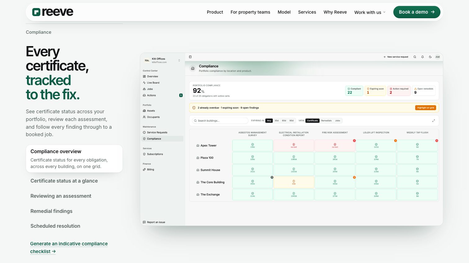
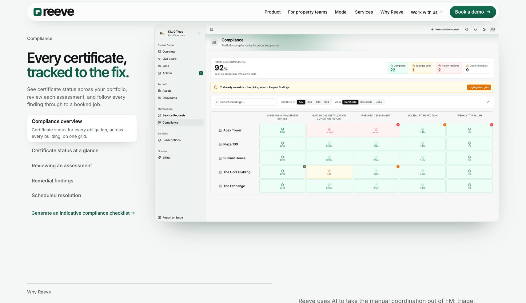
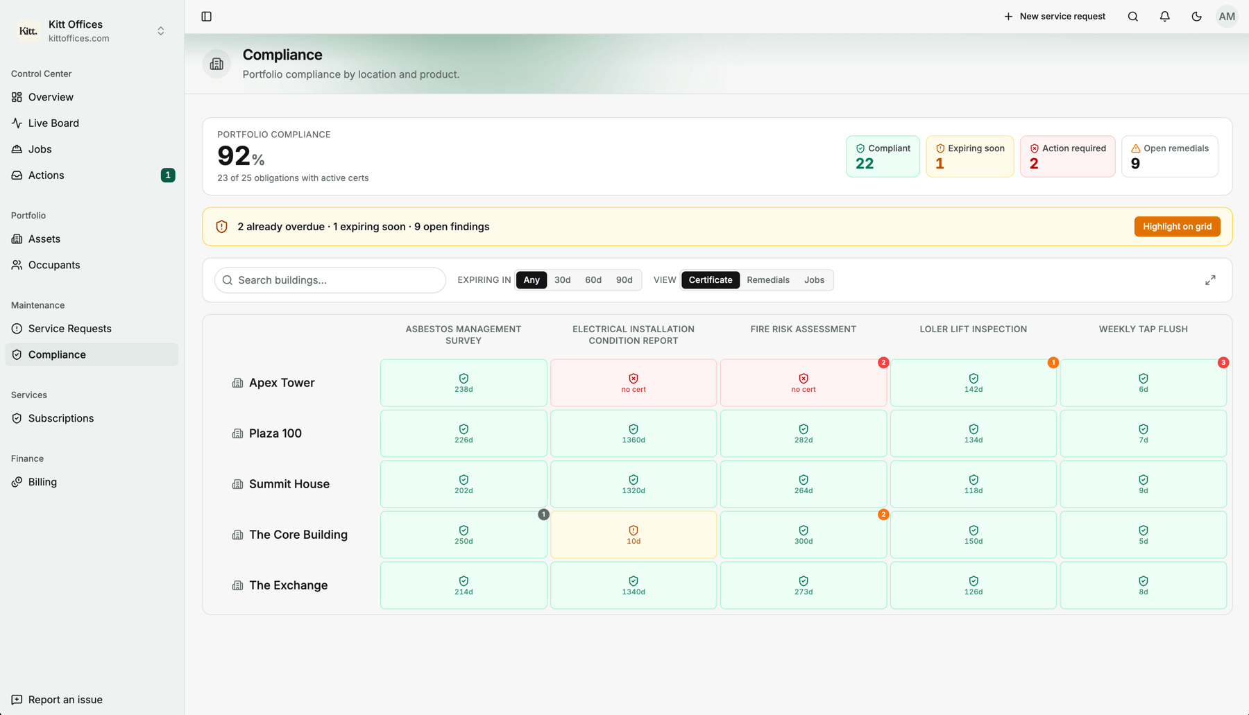
The standard laptop screens are 14-inch and 16-inch, which in Chrome are about 1512 by 850 and 1710 by 985. A section taller than the screen is never seen whole, so it has to fit the smaller one. Size large media by the height of the screen as well as its width: the compliance screenshot takes the smaller of its column's width and what the screen's height allows, so it shrinks to fit the 14-inch.
Colour
Paper greens and one dark panel.
Pale paper greens for the page, Reeve green for what matters, and one deep green surface for the moments that need weight.
Paper greens and one brand green
Pages sit on pale paper greens, not on white or grey. Reeve green carries the accents, with a lighter lift for the top of a gradient and a mint for glows. The values shown are read from the stylesheet in your browser.
--ix-paper
The page, and the top of the hero.
--ix-paper-deep
The foot of the hero. The darker paper, so text contrast is checked on it.
--ix-brand
Reeve green: the second half of a title, ticks, the main button.
--ix-brand-lift
The top of the green button's gradient.
--ix-mint
Glows and live dots. Light only: a glow in a dark green reads as a smudge.
--ix-mint-pale
The pale end of a glow.
--ix-ink
Body text, and any text on glass.
Three greys for secondary text
Each one reaches 4.5:1 on the darker paper, the WCAG AA level for text this size. The ratios shown are measured in your browser, not copied.
Ledes and section labels
--ix-muted · …
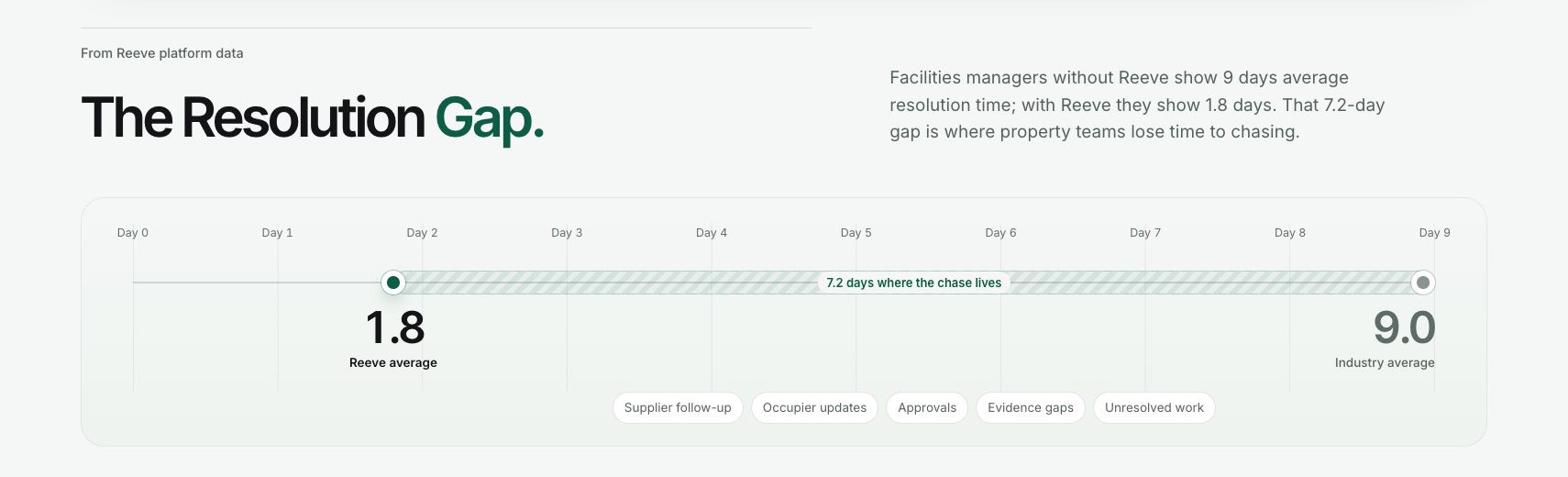
The losing side of a comparison
--ix-quiet · …
Small print and sources
--ix-faint · …
The deep green panel
The page's one dark surface: a green that deepens towards the foot, a mint glow and a faint white grid. It holds four things and no more: the platform demo, the Reeve card in Why Reeve, the lead delivery route and the closing call to action. Used more than that, it stops marking what matters.
Your portfolio, under control.
Book a walkthrough and we'll map how Reeve could keep facilities moving across your portfolio, from helpdesk and AI triage to operative dispatch, supplier coordination and resolution path reporting.
--ix-forest
The top of the panel.
--ix-forest-deep
The foot of the panel.
--ix-mint-ink
Accents and ticks on the panel, such as the green half of its title.
Text on frosted glass is the ink
Glass takes on the colour of whatever is behind it. Over the green panels a grey fell below 4.5:1, so any text on glass is set in the ink.
Text on glass, in the ink
Type
Inter Tight to head, Inter for the rest.
Two faces from one family, sentence case throughout, and British English with no em dashes.
Inter Tight for headings, Inter for everything else
Inter Tight is only for headings. Everything else is Inter, card titles included, as it is in the app: a tight face at card size reads cramped.
Inter Tight
Hero and section titles, at 600.
Inter
Body, ledes, buttons, labels and card titles.
How a section opens
A quiet label under a hairline says what the section is. The title follows, with its second half in brand green. Then one line of lede, and no more.
What Reeve does
The FM partner for property teams.
Our AI platform and FM team keep facilities moving across your portfolio. Start with one job, or review your current FM workflow.
No uppercase eyebrow pills
A capitalised label in a grey chip with a dot is the stock look of generated landing pages. It reads as a template, not as a page someone designed for Reeve. Use the label under the hairline instead.
The platform
Do open with a sentence-case label under a hairline.
Don't put an uppercase label in a chip with a dot.
British English, and no em dashes
Organise, colour, licence, centre. Where a sentence seems to want an em dash, use a colon, a comma or a full stop.
Organise a visit. We'll confirm the time by email.
Do write it in British English, in short sentences.
Organize a visit — we'll confirm the time by email.
Don't use American spelling or an em dash.
Surfaces
White cards, frosted glass.
Content sits on white cards over the paper, glass floats over photographs, and screenshots are framed as the app windows they are.
The white card
Content sits on white cards with a hairline edge and a soft shadow: the same depth as the example job card in the hero, made more opaque.
What we handle for you
- Reactive jobs
- Compliance checks
- Supplier coordination
- Operative dispatch
- Resolution path reporting
- Occupier updates
Frosted glass, with a solid fallback
The nav and the captions on photographs are frosted, so the page shows softly through them. Where a browser cannot blur, they fall back to a solid colour, never to a clear one that would leave text over a busy photo.

The faint green grid
A 48px grid of faint green lines sits behind the top of the hero and brightens round the pointer. The deep green panels carry the same grid in white. It always fades out before it reaches the content.
Photos shot on white sit on matching white
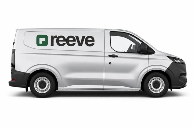
The van and the overalls are photographed on #fefefe, so their cards are #fefefe too and show no edge. Nothing goes behind them: no grid, no tint.
App screenshots are framed like an app window
A screenshot gets its own rounded edge, a hairline and a soft shadow, and no white mount round it. The screenshot is the window.
Motion
Arrive once, then hold still.
Movement marks something arriving. It plays once, can always be stopped, and stops entirely for anyone who asks for less motion.
Things arrive once
Words rise in and cards land on a spring, in reading order. A section plays as it first scrolls into view, and never again: motion that repeats on every scroll is noise. Without JavaScript, everything simply shows.
What Reeve does
The FM partner for property teams.
Our AI platform and FM team keep facilities moving across your portfolio. Start with one job, or review your current FM workflow.
What we handle for you
- Reactive jobs
- Compliance checks
- Supplier coordination
- Operative dispatch
- Resolution path reporting
- Occupier updates
With Reduce motion turned on, nothing moves.
Figures count up once
A figure counts up from zero the first time it is seen. The server renders the real number, so a visitor without JavaScript, or with reduced motion, reads it as it is.
Anything that plays by itself can be stopped
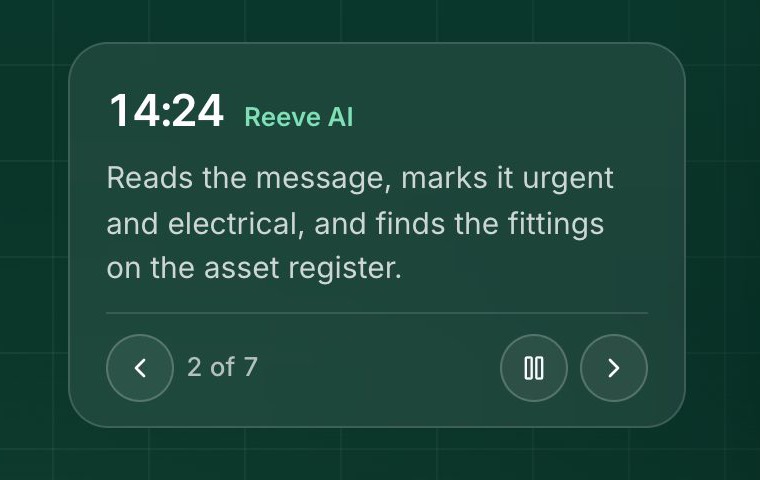
It runs only while it is on screen and stops for good once the visitor takes control. Anything that moves for more than five seconds has a way to pause it (WCAG 2.2.2). The platform demo has a pause button beside its step arrows; the compliance views stop when one is chosen.
Reduced motion holds everything still
With Reduce motion turned on, nothing animates: sections show as they are, the platform demo holds on its last step and figures show their value. Turn it on and press Play the arrival above to see.
Components
The homepage's pieces, reused as they are.
The buttons, the nav and the platform demo, with the rules each one keeps.
The floating nav
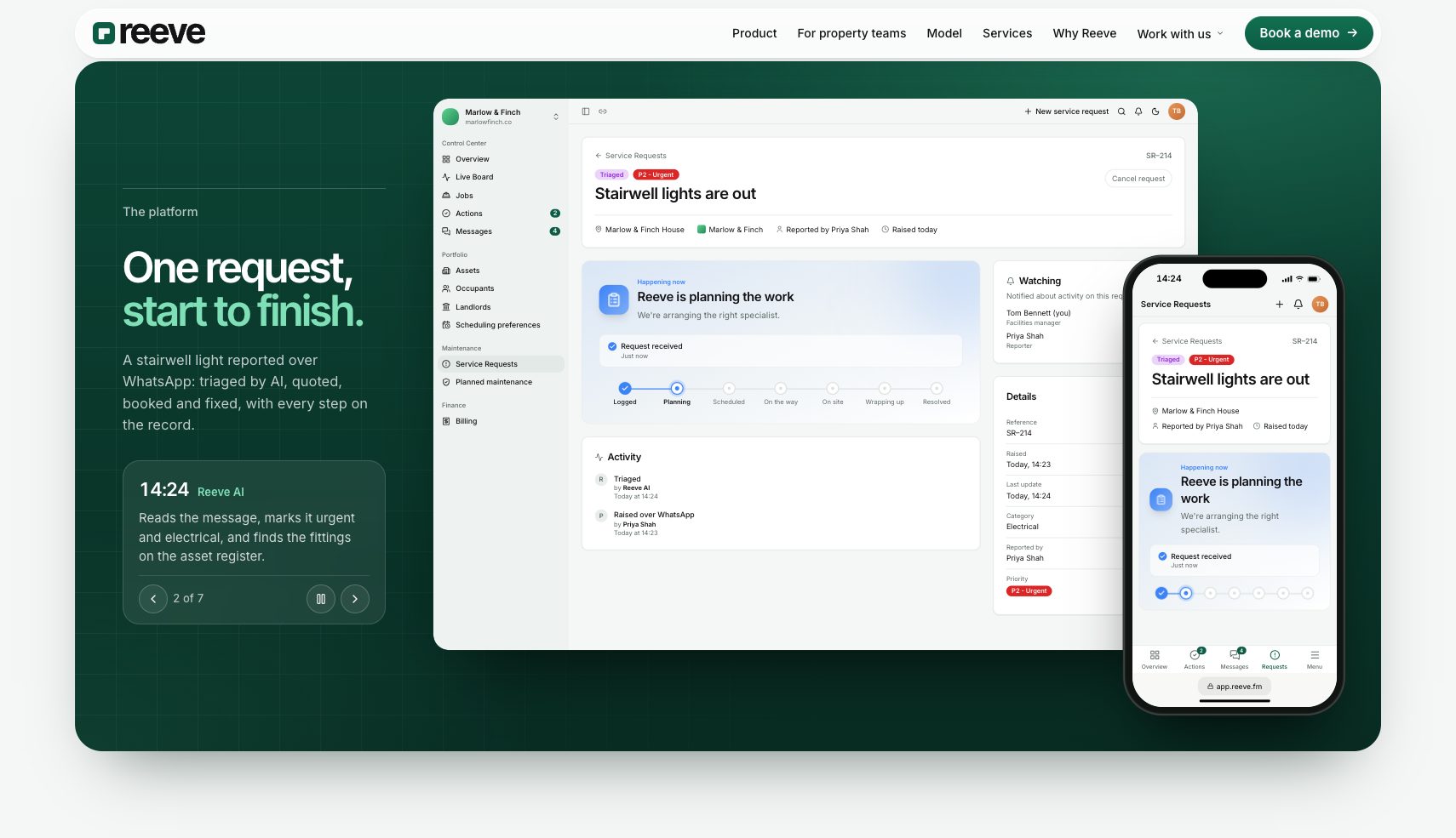
A frosted pill floating over the page on the content edges, with the green button at its end. The hero runs up underneath it, so the grid and the glow show through the glass. Here it sits over the platform demo. On a phone the button gives way, as it does on the site.
The platform demo shows the real product
Real app screens, and words taken from the app's own service-request-pulse.ts, never invented. Change the wording in the app first, then copy it across, so the demo never shows the product saying something it does not.
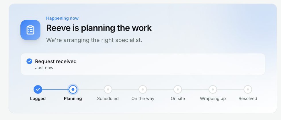
One timeline at a time
Never a list of stages beside a mockup that has its own stepper: the two read as competing timelines. In the platform demo one clock drives both screens and the caption, and the stepper inside the app is the only list of stages.